Fonts – They’re always in pairs
There's no denying that font choice is an integral part of any design. Choosing the right fonts can be a daunting process for any creator. Even the most experienced designer can work up a sweat when trying to match two fonts in perfect harmony.
Why do fonts matter so much? In most designs, fonts will act as your primary communicator. Choosing the wrong fonts, or too many fonts can result in your message getting lost, and appearing messy. The wrong choice will leave the viewer feeling uncomfortable – with that little niggle that something isn't quite right. The brain only has a specific capacity to process passages of text, so limiting your font choices to no more than two different fonts is critical. Any more than that and your design will start to look like a kinder project.
Using different fonts creates visual interest and can help make an essential part of your message stand out. Mixing it up between serif fonts (the fonts with little feet) and san serif fonts (the ones without the little feet) creates a beautiful contrast. Similarly, try a handwritten script font with san serif secondary messaging to catch your customer's attention.
So, what are the types of fonts you ask?
SERIF
A Serif typeface will have a small stroke found at the beginning and end of each letter – I like to refer to them as feet. A study conducted by the New York Times has found Serif fonts to be the most trustworthy and readable of all the font families. You'll find most large printed bodies of text such as books, magazines and newspapers use serif fonts because the little feet help with readability.

SAN SERIF
You can't understand a San Serif without a little language lesson – "Sans" in French translates to "without," so put the two words together and San Serif translates directly to "without serifs." If you look closely at the example below, you can see that there aren't any feet on the bottom of each letter, which gives a cleaner look to each letter. You'll notice that most websites will have San Serif fonts as the cleaner edges to each letter lends itself to better readability on screen. Some older displays made the serif's look fuzzy, also known as pixelation.

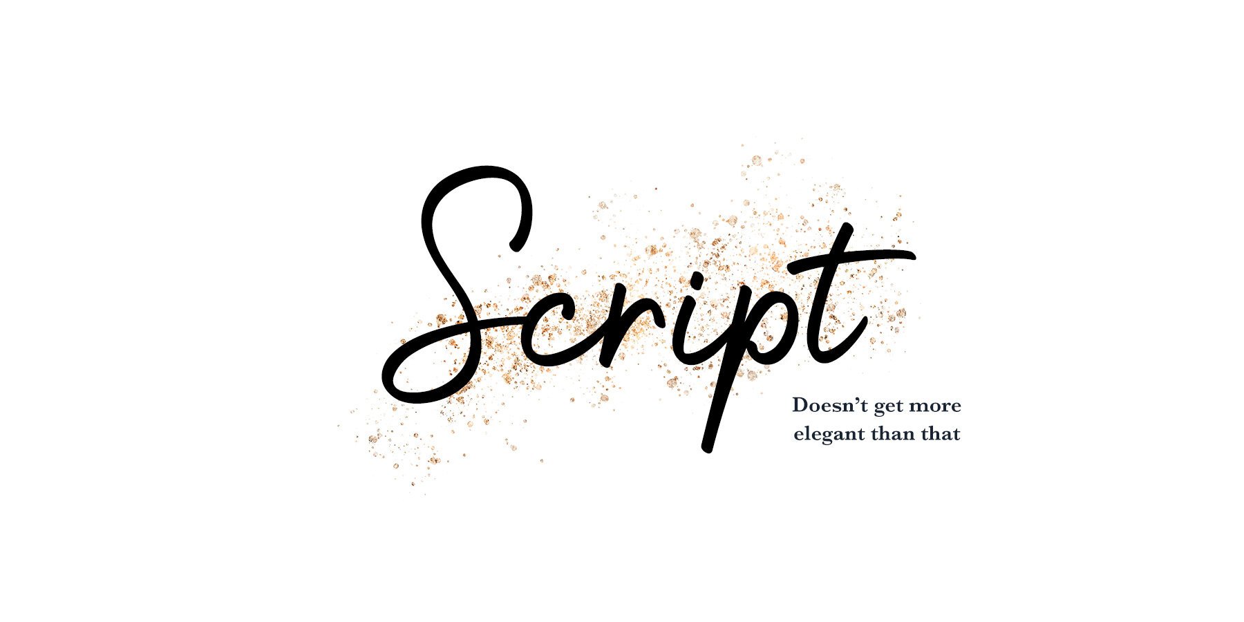
SCRIPT
Script fonts fall into another category entirely as their primary function is to imitate handwriting, giving the overall feeling of something more elegant and fancier. Script fonts are great to use in contrast to Serif and San Serif fonts.
DISPLAY TYPE
Display Type is typically a font designed for use on a larger scale such as headings. There are some stunning display fonts out there that are incredibly detailed which will also render them useless for large paragraphs of text. They will shine brightest when used at a larger scale and paired with something simple and readable.
TEXT TYPE
While Display Text can be large and shouty, Text Type is the polar opposite as it is created for its legibility. It works perfectly for large bodies of text at much smaller sizes.
So how do I go about pairing fonts?
Here's a couple of quick pointers to follow when selecting fonts for your designs:
KEEP IT IN THE FAMILY
Consider pairing a font of the same family with a different weight. This is a simple little trick that can wield some pretty impressive visual outcomes. Pairing a font with its bolder sibling can give you a sleek and modern feel. It will emphasise the most important part of your message and better yet – it's visually pleasing.
It's not just the bold version that can create an impact – consider the use of a regular and italic paired fonts. It will give an air of sophistication and has the same ability to emphasise your message clearly.

STANDING ON TWO FEET
Now that you can tell a Serif font from a San Serif font, consider playing around with different variations of the two. San Serif fonts in their most bold form can make stunning headings that will stand out like a flamingo among a gaggle of geese when paired with a simple serif counterpart. Similarly, there are some strikingly bold Serif fonts out there – one of my favourites is Playfair – that can be coupled with a simple San Serif to create the perfect marriage.

ONLY ONE DIVA IN THE SPOTLIGHT, PLEASE!
Only have one spotlight font! Choosing a beautiful display font or a well crafted handwritten script can be a brilliant and bold choice. But be sure to only choose one – if you choose two fonts of a decorative nature, they will clash worse than two siblings fighting over the last chocolate.
This will detract from your message and your audience will be left feeling like you've hit them over the head with a shovel. When selecting a script or display font make sure that you choose something that is still legible – too often people get caught up in the artistry of a display font that the actual message becomes illegible and your audience is lost.

One last thing, choosing the right font for your brand can say a lot about the type of attention you attract and the feeling it invokes in your audience. Whether you're going for playful and fun or elegance and sophistication never underestimate the power of your font choice.
Have fun with your type, keep it to a pair of fonts as a rule of thumb, get creative and tag me in your latest creations! I would love to see what you crazy birds come up with – if you get stuck feel free to reach out.
A couple of spots have opened up for creative mentoring if you're interested – contact me here. I would love to help you with levelling up your business using your creativity.